Wednesday, February 20, 2008

A Covers Addendum

I hope Kristiana doesn't mind a post so soon after hers, but I wanted to add my two-blogcents to her comments.

I, too, get really frustrated at the horrible renditions of book covers for young adult. For example, look at the 3rd in the Maximum Ride series by James Patterson (hardcover) versus the massmarket paperback. 
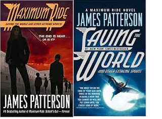
Okay...that isn't really that bad. And we are talking king-of-mass market, James Patterson.
Here are two that will really make the point--the (vomit) massmarket paperback version of Faerie Wars by Herbie Brennan and Ender's Game by Orson Scott Card. Who the heck are they marketing to? Who are these masses??!!


I realize my examples all fall into the sci-fi/fantasy realm, but boy do they make the point. The Herbie Brennan series' covers are all so beautiful and their massed counterparts are campy at best (think Napoleon Dynamite's liger drawings). Then there is poor Ender...an insulting cover to anyone who's read the book. Am I right?!

So, the mass market paperback is an inexpensive publishing format. Its purpose is to sell. Again, who are the masses the marketers have in mind? Creating an ugly version of an original cover sells more books? Even if a mass market publisher cannot use the original cover, can't they find someone to create something appealing? Seriously, call me. I work fairly cheap and would love to draw my own frontspiece for these books. If anyone has any insight (or knows a publishing house that wants to hire me), please let me know.


I looked at many books while researching this topic. For the most part, in the YA/teen category, the mass market or paperback covers were not the worst. It's just that when they were bad, they were rotten!


I'm going to end this with one last example...and this one's for the ladies.

Judy Blume's novels had quite an impact on me growing up. I had all of them and ALL of them had dogeared pages, frayed edges, bent covers, and the most love I could give a book. Anyway, look at the following covers. Which do you remember? Which do you like? Are there any you don't? (btw, I had so much fun finding all those covers. memories!!)

Covers and where I am coming from - a brief history

It is disappointing to me when hardcover books have great covers and when they are released in paperback they are...how should I say this...not as cute. Then when I realize how awesome the UK covers are I get pretty sad.

I realized my obsession when "Spot of Bother" - a book that is totally strange, but enjoyable and great - came out in paperback. The HC was beautiful, and probably why I picked up the book in the first place. The paperback was just plain creepy. My thought is, maybe Random House wanted to make sure people didn't pick up this book expecting another "Curious Incident about the Dog in the Night". That would be understandable, but it seemed that Random House is trying to scare their potential readers away.


Another book cover I was mildly disappointed in is "The Double Bind". There seems to be only one cover for HC, paperback and the UK. This cover doesn't make me want to read the book. It wouldn't make me pick it up. I would assume terribly bad things about this book if I was only judging it by the cover. Good for me I've wanted to read this book for a number of different reasons. Now that I have started it I see why the cover is what it is, but I still think it could have been better - and by better I mean more to my liking.


I get really excited for books to come out in paperback. A lot of times people don't want to buy hardcover books. They can be a little pricey, and I think that is why we get so excited for trade paperback releases. It means more of our friends and customers will take the chance and read something we're crazy about.

Sometimes the TP cover is scary, sometimes it hasn't changed at all and sometimes it totally rocks. In the slew of books recently out in TP Moral Disorder arrived. Everyone knows I'm pretty crazy about Margaret Atwood, so I was elated with the new cover. For the record I did not have a problem with the HC. It was a nice jacket and the cover itself was a rich red cover. What I love about the new cover is that it is so different from the HC. It is bright and colorful and unique, and I think...way better than the UK version.


As you can tell this cover discussion is just getting started, but we hope you like the new books we're excited about, with or without their covers.

Thursday, February 14, 2008

Google Reader

I've started using Google Reader which means I'm reading blogs all over the place. I feel like I am spying on other bookstores, but in a fun, non-competitive way. It is very fun and educational. I stumbled across this link to an amazing set of book store pictures. I hope you enjoy them as much as I did.

Thanks to The Written Nerd for finding it in the first place!

Thursday, February 7, 2008

Judging Books by Their Covers

Hypothetical situation, here:

Say you wrote your first novel. It was funny, moving, brilliantly-executed. You were hoping for a minor success, a deft Goodbye, Columbus before your Portnoy’s Complaint. But people caught on, and you were nominated for a National Book Award. Everyone in the bookselling world tells you to wait until your book comes out in paperback. Sales are gonna take off, they said. You won’t even believe it.

And then we came to the paperback cover:

Now tell me, why does a book that has the potential to not only be a big, trade paper hit but a solid and long-running midlist seller get a cover designed like this? The little caricatures are straight out of the For Better or Worse comic strip. Which isn’t a bad comic, as comics go. It isn’t Calvin and Hobbes, or The Adventures of Doctor McNinja (Chris’ fave), or even Luann (my high school secret passion), but at least it isn’t Cathy.

I digress, which my mother said never to do in public.

But this cover is frickin' Cathy, and the inside is such goodness! And it is in this spirit we launch the series, “The Brits Do It Better.” We’re not talking healthcare, or dance music, or espionage. We’re talking book jacket design. And first up is the British cover for Then We Came to the End, which I asked (well, told) our Little, Brown publicist not once but twice to use for the U.S. paperback:

Look at the little people, in the little cubicle letters! It's almost like a Chris Ware comic. I’m sure there were rights issues, but in the words of Will Arnet, “C’mon!”

Kristiana offers up The Raw Shark Texts -- a book she has been a huge evangelist for -- as a second example of the United Kingdom of Better Design Effect (or U.K.B.D.E., for the Tom Clancy fans).

Here's the U.S. paperback cover:

The most inspiring part of this cover is the National Bestseller tagline, and that ain't saying much. But you look at the Brits' cover, and it's a wonderland of dense, visually arresting design that not only stands on its own but gives you a sense of what's printed on the four-hundred odd pages of pulp behind the cover.

This might sound like judging a book by its cover, but it's not. Both of these books are on our personal list of favorites from last year. But to face facts, everyone judges books by their covers. And why not? If it's reasonable to go out for dinner and expect both a well-prepared meal and some nice presentation, the same should go for books. Most of the art of a book comes from its language, but who can deny the seduction of thick, heavy-bond paper, uncut pages, and a fine, thoughtfully-produced cover. It's part of what makes books an object of art as well as its vessel.