Hypothetical situation, here:
Say you wrote your first novel. It was funny, moving, brilliantly-executed. You were hoping for a minor success, a deft Goodbye, Columbus before your Portnoy’s Complaint. But people caught on, and you were nominated for a National Book Award. Everyone in the bookselling world tells you to wait until your book comes out in paperback. Sales are gonna take off, they said. You won’t even believe it.
And then we came to the paperback cover:

Now tell me, why does a book that has the potential to not only be a big, trade paper hit but a solid and long-running midlist seller get a cover designed like this? The little caricatures are straight out of the For Better or Worse comic strip. Which isn’t a bad comic, as comics go. It isn’t Calvin and Hobbes, or The Adventures of Doctor McNinja (Chris’ fave), or even Luann (my high school secret passion), but at least it isn’t Cathy.
I digress, which my mother said never to do in public.
But this cover is frickin' Cathy, and the inside is such goodness! And it is in this spirit we launch the series, “The Brits Do It Better.” We’re not talking healthcare, or dance music, or espionage. We’re talking book jacket design. And first up is the British cover for Then We Came to the End, which I asked (well, told) our Little, Brown publicist not once but twice to use for the U.S. paperback:

Look at the little people, in the little cubicle letters! It's almost like a Chris Ware comic. I’m sure there were rights issues, but in the words of Will Arnet, “C’mon!”
Kristiana offers up The Raw Shark Texts -- a book she has been a huge evangelist for -- as a second example of the United Kingdom of Better Design Effect (or U.K.B.D.E., for the Tom Clancy fans).
Here's the U.S. paperback cover:
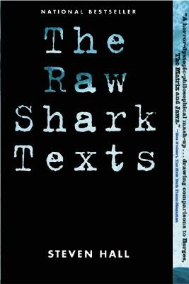
The most inspiring part of this cover is the National Bestseller tagline, and that ain't saying much. But you look at the Brits' cover, and it's a wonderland of dense, visually arresting design that not only stands on its own but gives you a sense of what's printed on the four-hundred odd pages of pulp behind the cover.
This might sound like judging a book by its cover, but it's not. Both of these books are on our personal list of favorites from last year. But to face facts, everyone judges books by their covers. And why not? If it's reasonable to go out for dinner and expect both a well-prepared meal and some nice presentation, the same should go for books. Most of the art of a book comes from its language, but who can deny the seduction of thick, heavy-bond paper, uncut pages, and a fine, thoughtfully-produced cover. It's part of what makes books an object of art as well as its vessel.


3 comments:
I'm really enjoying the blog!
Have you read Chabon's new book "Gentlemen of the Road"? The British cover is so beautiful: http://www.amazon.co.uk/Gentlemen-Road-Michael-Chabon/dp/0340953543/ref=sr_1_2?ie=UTF8&s=books&qid=1202669603&sr=1-2
compared to the US version:
http://www.amazon.com/Gentlemen-Road-Adventure-Michael-Chabon/dp/0345501748/ref=pd_bbs_sr_2?ie=UTF8&s=books&qid=1202669632&sr=1-2
Also, in France, the title of Pessl's "Special Topics in Calamity Physics" is just a boring "La physique des catastrophes"...French books definitely screw up titles and always take the cake for the most ugly/boring book covers.
For the record, Then We Came to the End is on our shelves, and the cover is a little better in person.
I just saw the cover to the Chabon and it IS beautiful!
I'm ga-ga for Chabon, and I love that cover! Oh those Brits, with their flashy covers and clever sitcoms. Soon they'll be more cultured than us, or maybe develop better accents than ours... Oh.
Post a Comment